Welcome to our website
Quadra Premium Theme Documentation
Examples and details for the Quadra!
You can find examples and descriptions about all theme in this page. Also you can contact with us if you having problems.
Installation
- Unzip the downloaded package and open the Quadra. You can organize your files locally. You need to upload files to your server as a program assistant.
- You can edit your tags at the top of your HTML file. For example;
<title> Your Title </title>Your Page Title<meta name="description" content="Your description" />- Your Website's Description<meta name="keywords" content="example, example" />- Your Website's Keywords<link rel="icon" type="image/png" href="images/favicon.png" />- Your Website's Favicon<link rel="apple-touch-icon" href="images/apple-touch-icon.png"/>- Apple Touch Icon<link rel="stylesheet" href="css/plugins.css" />- CSS Files<link href="https://fonts.googleapis.com/css?family=Open+Sans:300,400,600,700,800" rel="stylesheet">- Google Fonts
- You can edit your tags at the top of your HTML file. For example;
Quadra/content- Files of demos and variationsQuadra/css- CSS files and fonts of all theme (demos and variations have their own .css files in the /content folder).Quadra/images- All assets. Images, backgrounds, icons, videos, gifs and .psd files.Quadra/js- All javascript files (demos and variations have their own .js files in the /content folder).Quadra/php- PHP support for social modules, contact form types, mailchimp, planner and wishboxes.
- You should use an editor for customize theme and add your contents, images .etc.
- You should use an application for upload your website to server.
Example HTML Page
    <!DOCTYPE html>
    <html lang="en" xmlns="http://www.w3.org/1999/xhtml">
        <head>
            <meta charset="utf-8" />
            <meta http-equiv="X-UA-Compatible" content="IE=edge">
            <!-- Title, description, keywords -->
            <title>Your Title</title>
            <meta name="description" content="Your description" />
            <meta name="keywords" content="example, example" />
            <!-- Favicon, Touch icon -->
            <link rel="icon" type="image/png" href="images/favicon.png" />
            <link rel="apple-touch-icon" href="images/apple-touch-icon.png"/>

            <!-- CSS Files -->
        </head>
        <!-- BODY START -->
        <body>

            <!-- NAVIGATION -->
            <nav id="navigation" class="nav-white shrink hide-by-scroll border hover modern hover4 radius-drop" data-offset="0">
                ...
            </nav>
            <!-- END NAVIGATION -->

            <!-- Home -->
            <section id="home" class="xxl-py t-center white fullwidth">
                <!-- Background image - you can choose parallax ratio and offset -->
                <div class="bg-parallax skrollr" data-anchor-target="#home" data-0="transform:translate3d(0, 0px, 0px);" data-500="transform:translate3d(0px, 200px, 0px);" data-background="image path"></div>
                <!-- Container -->
                <div class="container relative">
                   ...
                </div>
                <!-- End Container -->
            </section>
            <!-- End Home -->

            <!-- Page Details -->
            <section class="py">
                ...
            </section>

            <!-- FOOTER -->
            <footer id="footer" class="classic_footer">
                ...
            </footer>
            <!-- END FOOTER -->

            <!-- Quick Contact Form -->
            <div class="quick-contact-form">
                ...
            </div>

            <!-- Contact us button -->
            <div class="drop-msg click-effect dark-effect"><i class="fa fa-envelope-o"></i></div>
            <!-- Back To Top Button -->
            <a id="back-to-top" href="#top"><i class="fa fa-angle-up"></i></a>

            <!-- SEARCH FORM FOR NAV -->
            <div class="fs-searchform">
                ...
            </div>
            <!-- END SEARCH FORM -->

            <!-- Messages for contact form -->
            <div id="error_message" class="clearfix">...</div>
            <div id="submit_message" class="clearfix">...</div>

            <!-- JS Files -->

        </body>
        <!-- Body End -->
    </html>
You can find a lot of example pages in the Quadra.
Skins and Colors
- All demos and variations have their own skins in the
content/yourDemo/css/folder. Those files have color styles and.coloredXclasses for the demos. You can give different colors/styles to each demos. - You can find
default.cssfile in thecss/skins/path for subpages. You can edit the colors and another options for only subpages. - You can get jQuery support for this case. You can add
data-color="#000"ordata-color="purple"codes for text colors. There is support for background colors too. For example;data-bgcolor="#4b4b4b"ordata-bgcolor="red".etc - You can use Bootstrap or Quadra colors for elements like
.bg-warning-.bg-secondary-.bg-colored-.bg-colored2-.bg-dark4-.bg-gray7-.bg-gradient3.etc
A Few Examples:
Code example of this page
<div class="row fs-12 white bold t-center mt-15 gap-15">
    <div class="col-sm-2 col-6"><div class="bg-colored radius px-15 py-15">.bg-colored</div></div>
    <div class="col-sm-2 col-6"><div class="bg-colored1 radius px-15 py-15">.bg-colored1</div></div>
    <div class="col-sm-2 col-6"><div class="bg-colored2 radius px-15 py-15">.bg-colored2</div></div>
    <div class="col-sm-2 col-6"><div class="bg-gray3 radius dark px-15 py-15">.bg-gray3 .dark</div></div>
    <div class="col-sm-2 col-6"><div class="bg-gray9 radius px-15 py-15">.bg-gray9</div></div>
    <div class="col-sm-2 col-6"><div class="bg-black radius px-15 py-15">.bg-black</div></div>
    ...
</div>
You can see more examples on here.
Quadra Helpers
Quadra helpers for create pages easily and fastest. You can use 50k+ classes with first letters. There is a jQuery support for this feature. For example, .fs-12 - .lh-25 .etc
Example Helpers;
| Example Helpers | Target Style | Value |
|---|---|---|
| .fs-12 | Font Size | font-size:12px; |
| .fs-80 | Font Size | font-size:146px; |
| .fw-900 | Font Weight | font-weight:900; |
| lh-22 | Line Height | line-height:22px; |
| top-45 | Top | top:45px; |
| left-150 | Left | left:150px; |
| right-200 | Right | right:200px; |
| bottom-80 | Bottom | bottom:80px; |
| mt-45 | Margin Top | margin-top:45px; |
| mr-70 | Margin Right | margin-right:70px; |
| ml-50 | Margin Left | margin-left:50px; |
| mb-300 | Margin Bottom | margin-bottom:300px; |
| mx-30 | Margin Left, Margin Right | margin-left:30px; margin-right:30px; |
| my-15 | Margin Top, Margin Bottom | margin-top:15px; margin-bottom:15px; |
| py-15 | Padding Top, Padding Bottom | padding-top:15px; padding-bottom:15px; |
| px-30 | Padding Left, Padding Right | padding-left:30px; padding-right:30px; |
| pt-45 | Padding Top | padding-top:45px; |
| pr-70 | Padding Right | padding-right:70px; |
| pb-150 | Padding Bottom | padding-bottom:150px; |
| width-30vw | Width | width:30vw; |
| height-40vw | Height | height:40vw; |
| mxw-50vw | Max Width | max-width:50vw; |
| height-50vh | Height | height:50vh; |
| mxh-90 | Max Height | max-height:90px; |
| ls-2 | Letter Spacing | letter-spacing:2px; |
| b-4 | Border Width | border-width:4px; |
| bt-1 | Border Top Width | border-top-width:1px; |
| br-2 | Border Right Width | border-right-width:2px; |
| bb-3 | Border Bottom Width | border-bottom-width:3px; |
| bl-5 | Border Left Width | border-left-width:5px; |
| zi-50 | Z-Index | z-index:50; |
| opacity-5 | Opacity | opacity:0.5; |
You can see all the list of helpers in css/theme.css file.
Example Classes;
| Example Classes | Target Style | Value |
|---|---|---|
| .fullwidth | Width | width:100%; |
| .width-full | Width | width:(window-width); |
| .height-full | Height | height:(window-height); |
| .mnh-full | Min Height | min-height:(window-height); |
| .mnw-full | Min Width | min-width:(window-width); |
| .bold | Font Weight | font-weight:700; |
| .light | Font Weight | font-weight:300; |
| .t-right | Text Align | text-align:right; |
| .t-center | Text Align | text-align:center; |
| .t-left | Text Align | text-align:left; |
| .relative | Position | position:relative; |
... You can see much more helpers in css/theme.css file.
Page Options
You can use Bootstra 5+ columns directly on Quadra. All column systems ready to use.
Bootstrap Columns
You can see documentation on here for bootstrap columns; Bootstrap Grid System. Or you can check using examples.
For Extra Large Screens - Columns have 33% wide only large screens.
.col-xl-2.col-xl-4.col-xl-6For Large Screens - Columns have 33% wide only large screens.
.col-lg-4.col-lg-4.col-lg-4For Medium Screens - Columns have 25%, 50% and 25% wides on smaller than medium screens.
.col-md-3.col-md-6.col-md-3For Small Screens - Columns have 33.33%, 25% and 41.66% wide on smaller than small screens.
.col-sm-4.col-sm-3.col-sm-5For All Screens - Columns have 16.66%, 50% and 33.33% wide on all screens.
.col-2.col-6.col-4ALL Use Together
.col-md-3 .col-12.col-md-5 .col-12.col-md-4 .col-12.col-md-4 .col-6.col-md-4 .col-6.col-md-4 .col-12Mobile & Medium Columns start at 50% wide on mobile and bump up to 33.3% wide on desktop
.col-md-4 .col-6.col-md-4 .col-6.col-md-4 .col-6Offsetting Columns
Offset Columns
Move columns to the right using .col-md-offset-* classes. These classes increase the left margin of a column by * columns. For example, .col-md-offset-4 moves .col-md-4 over four columns.
.col-md-4 offset-md-0.col-md-4 offset-md-4.col-md-3 offset-md-3.col-md-3 offset-md-3.col-md-6 offset-md-3
    <div class="row">
        <div class="col-md-4">...</div>
        <div class="col-md-4 offset-md-4">...</div>
    </div>
    <div class="row">
        <div class="col-md-3 offset-md-3">...</div>
        <div class="col-md-3 offset-md-3">...</div>
    </div>
    <div class="row">
        <div class="col-md-6 offset-md-3">...</div>
    </div>
You can also override offsets from lower grid tiers with .offset-*-0 classes.
Extras with Bootstrap 5
How it works
Bootstrap’s grid system uses a series of containers, rows, and columns to layout and align content. It’s built with flexbox and is fully responsive. Below is an example and an in-depth look at how the grid comes together. This is a quote. The original Bootstrap 5 documentation is here..
One of three columns
One of three columns
One of three columns
<div class="container">
    <div class="row">
        <div class="col-sm">
            One of three columns
        </div>
        <div class="col-sm">
            One of three columns
        </div>
        <div class="col-sm">
            One of three columns
        </div>
    </div>
</div>
Auto-layout columns
Utilize breakpoint-specific column classes for easy column sizing without an explicit numbered class like .col-sm-6. This is a quote.
The original Bootstrap 5 documentation is here..
One of three columns
One of three columns
One of three columns
One of three columns
One of three columns
<div class="container">
    <div class="row">
        <div class="col">
            1 of 2
        </div>
        <div class="col">
            2 of 2
        </div>
    </div>
    <div class="row">
        <div class="col">
            1 of 3
        </div>
        <div class="col">
            2 of 3
        </div>
        <div class="col">
            3 of 3
        </div>
    </div>
</div>
Sliders
Featured Sliders Quadra is have stunning and super customizable slider demos. You can choose your slider in 130+ slider examples. Current sliders are here;
Revolution Slider
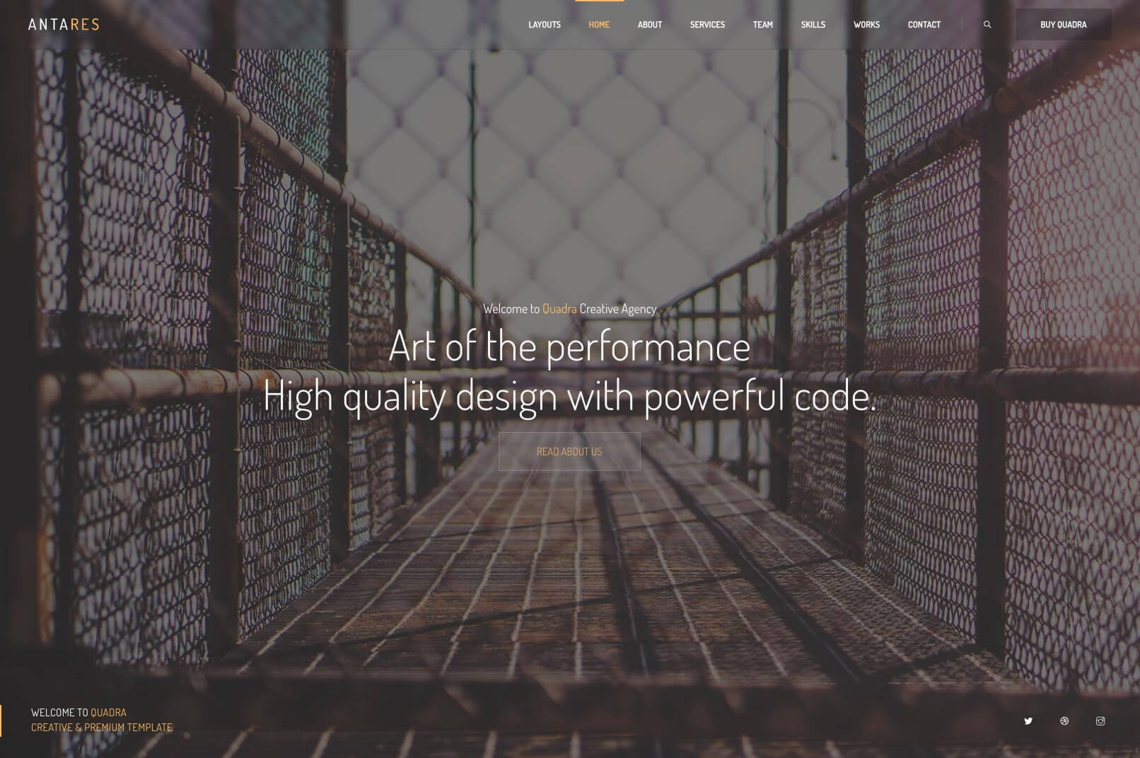
This slider example belongs to the Antares Demo. Images and some styles can be used on this demo.
    <!-- HOME SECTION -->
    <section id="home" class="rev_slider_wrapper fullscreen-container" >
        <!-- Start Slider -->
        <div id="home_slider" class="rev_slider fullscreenbanner lightbox_gallery">
            <!-- Slider Container -->
            <ul>
                <!-- Slide -->
                <li data-masterspeed="400" data-transition="fade" data-thumb="content/helios/images/home_01.jpg" data-saveperformance="off"  data-title="Office" data-description="Home Slider">
                    <!-- Background Image -->
                    <img src="content/helios/images/home_01.jpg"  alt="Image Background"  data-bgposition="center center" data-bgfit="cover" data-bgrepeat="no-repeat" data-bgparallax="9" class="rev-slidebg" data-no-retina>
                    <!-- Layer -->
                    <div class="tp-caption extrabold colored rs-parallaxlevel-8"
                    data-x="['center','center','center','center']"
                    data-y="['middle','middle','middle','middle']"
                    data-fontsize="['40','37','33','23']"
                    data-lineheight="60"
                    data-letterspacing="['-2','-2','-1.5','-0.5']"
                    data-frames='[{"delay":"+1000","speed":2000,"frame":"0","from":"y:50px;opacity:0;fb:20px;","to":"o:1;fb:0;","ease":"Power4.easeOut"},{"delay":"wait","speed":300,"frame":"999","to":"opacity:0;fb:0;","ease":"Power3.easeInOut"}]'
                    data-hoffset="['0','0','0','0']"
                    data-voffset="['-20','-15','-14','-10']">
                        Art of the performance.
                    </div>
                    <!-- Layer -->
                    <div class="tp-caption extrabold white rs-parallaxlevel-8"
                    data-x="['center','center','center','center']"
                    data-y="['middle','middle','middle','middle']"
                    data-fontsize="['40','37','33','23']"
                    data-lineheight="60"
                    data-letterspacing="['-2','-2','-1.5','-0.5']"
                    data-frames='[{"delay":"+1200","speed":2000,"frame":"0","from":"y:50px;opacity:0;fb:20px;","to":"o:1;fb:0;","ease":"Power4.easeOut"},{"delay":"wait","speed":300,"frame":"999","to":"opacity:0;fb:0;","ease":"Power3.easeInOut"}]'
                    data-hoffset="['0','0','0','0']"
                    data-voffset="['27','24','18','15']">
                        High quality design <span class="playfair extrabold italic">with powerful code.</span>
                    </div>
                </li>
                <!-- End Slide -->

                <!-- Slide -->
                <li data-masterspeed="400" data-transition="fade" data-thumb="content/helios/images/home_02.jpg" data-saveperformance="off"  data-title="Office" data-description="Home Slider">
                    <!-- Background Image -->
                    <img src="content/helios/images/home_02.jpg"  alt="Image Background"  data-bgposition="center center" data-bgfit="cover" data-bgrepeat="no-repeat" data-bgparallax="9" class="rev-slidebg" data-no-retina>
                    <!-- Layer -->
                    <div class="tp-caption extrabold colored rs-parallaxlevel-8"
                    data-x="['center','center','center','center']"
                    data-y="['middle','middle','middle','middle']"
                    data-fontsize="['40','37','33','23']"
                    data-lineheight="60"
                    data-letterspacing="['-2','-2','-1.5','-0.5']"
                    data-frames='[{"delay":"+1000","speed":2000,"frame":"0","from":"y:50px;opacity:0;fb:20px;","to":"o:1;fb:0;","ease":"Power4.easeOut"},{"delay":"wait","speed":300,"frame":"999","to":"opacity:0;fb:0;","ease":"Power3.easeInOut"}]'
                    data-hoffset="['0','0','0','0']"
                    data-voffset="['-20','-15','-14','-10']">
                        Unlimited Helpers With 600+ Templates
                    </div>
                    <!-- Layer -->
                    <div class="tp-caption extrabold white rs-parallaxlevel-8"
                    data-x="['center','center','center','center']"
                    data-y="['middle','middle','middle','middle']"
                    data-fontsize="['40','37','33','23']"
                    data-lineheight="60"
                    data-letterspacing="['-2','-2','-1.5','-0.5']"
                    data-frames='[{"delay":"+1200","speed":2000,"frame":"0","from":"y:50px;opacity:0;fb:20px;","to":"o:1;fb:0;","ease":"Power4.easeOut"},{"delay":"wait","speed":300,"frame":"999","to":"opacity:0;fb:0;","ease":"Power3.easeInOut"}]'
                    data-hoffset="['0','0','0','0']"
                    data-voffset="['27','24','18','15']">
                        Choose a demo and create an <span class="playfair extrabold italic">awesome website!</span>
                    </div>
                </li>
                <!-- End Slide -->
            </ul>
            <!-- End Container -->
        </div>
        <!-- End Slider -->

    </section>
    <!-- END HOME SECTION -->
Slider options with Javascript:
//*********************************************
//  REVOLUTION SLIDER FOR HOME
//*********************************************

    var tpj=jQuery;
    var revapi2;
    if(tpj("#home_slider").revolution == undefined){
        revslider_showDoubleJqueryError("#home_slider");
    }else{
        revapi2 = tpj("#home_slider").show().revolution({
            sliderType:"standard",
            jsFileLocation:"js/revolutionslider/",
            sliderLayout:"fullwidth",
            delay:9000,
            navigation: {
                keyboardNavigation: "on",
                keyboard_direction: "horizontal",
                mouseScrollNavigation: "off",
                onHoverStop: "off",
                touch: {
                    touchenabled: "on",
                    swipe_threshold: 75,
                    swipe_min_touches: 1,
                    swipe_direction: "horizontal",
                    drag_block_vertical: false
                },
                arrows: {
                    style: "uranus",
                    enable: true,
                    hide_onmobile: true,
                    hide_onleave: true,
                    tmp: '',
                    left: {
                        h_align: "left",
                        v_align: "center",
                        h_offset: 0,
                        v_offset: 0
                    },
                    right: {
                        h_align: "right",
                        v_align: "center",
                        h_offset: 0,
                        v_offset: 0
                    }
                },
                bullets: {
                    enable: true,
                    hide_onmobile: true,
                    style: "uranus",
                    hide_onleave: false,
                    direction: "horizontal",
                    h_align: "center",
                    v_align: "bottom",
                    h_offset: 0,
                    v_offset: 50,
                    space: 7,
                    tmp: '<span class="tp-bullet-inner"></span>'
                }
            },
            responsiveLevels:[1240,1240,778,480],
            visibilityLevels:[1240,1240,778,480],
            gridwidth:[1240,1240,778,480],
            gridheight:[840,700,480,440],
            parallax: {
                type:"scroll",
                origo:"slidercenter",
                speed:2000,
                levels:[2,3,4,5,8,10,12,16,30],
            },
            shadow:0,
            spinner:"off",
            stopLoop:"off",
            stopAfterLoops:0,
            stopAtSlide:0,
            disableProgressBar:"on",
            shuffle:"off",
        });
    }
And you can see 100+ slider examples on here: Premium Revolution Slider Examples - All slider examples included the theme. You can see detailed documentation of Revolution Slider on here: Revolution Slider Documentation.
Slick Slider
    <!-- CONTENT -->
    <section id="home" class="t-center white fullwidth">
        <!-- Hero Slider -->
        <div class="hero-slider height-760 custom-slider qdr-controls c-grab" data-slick='{"dots": true, "arrows": true, "autoplay": true, "autoplaySpeed": 6000, "pauseOnHover": false, "speed": 700, "draggable":true, "slidesToShow": 1, "slidesToScroll": 1, "responsive":[{"breakpoint": 1024,"settings":{"slidesToShow": 1}}]}'>
            <!-- Slide -->
            <div class="slide moving-container">
                <!-- Your Image -->
                <div class="slide-img bg-soft bg-soft-dark2" data-background="images/backgrounds/background_21.jpg"></div>
                <!-- Details -->
                <div class="details">
                    <!-- Centered Container -->
                    <div class="container v-center">
                        <div class="skrollr moving" data-0="opacity:1;" data-200="opacity:0;">
                            <div class="translatez-sm">
                                <h4 class="font-secondary animated fs-16-sm" data-animation="fadeInUp" data-animation-delay="600">
                                    We dreaming of the future. Join us!
                                </h4>
                            </div>
                            <div class="translatez-xs">
                                <h1 class="bold-title mini-mt animated font-16-mobile" data-animation="fadeInUp" data-animation-delay="800">
                                    Create your story with the Quadra Responsive theme.
                                </h1>
                            </div>
                            <div class="translatez-md">
                                <a href="#" class="hero-slider-next lg-btn mt-15 inline-block border-btn border-dashed b-gray3 radius-lg bold-subtitle font-12 white animated bg-colored1-hover border-colored1-hover slow" data-animation="fadeInUp" data-animation-delay="1000">
                                    EXPLORE MORE
                                </a>
                            </div>
                        </div>
                    </div>
                </div>
                <!-- End Details -->
            </div>
            <!-- End Slide -->
            <!-- Slide -->
            <div class="slide moving-container">
                <!-- Your Image -->
                <div class="slide-img bg-soft bg-soft-dark2" data-background="images/backgrounds/background_19.jpg"></div>
                <!-- Details -->
                <div class="details">
                    <!-- Centered Container -->
                    <div class="container v-center">
                        <div class="skrollr moving" data-0="opacity:1;" data-200="opacity:0;">
                            <div class="translatez-sm">
                                <h4 class="font-secondary animated fs-16-sm" data-animation="fadeInUp" data-animation-delay="600">
                                    We dreaming of the future. Join us!
                                </h4>
                            </div>
                            <div class="translatez-xs">
                                <h1 class="bold-title mini-mt animated font-16-mobile" data-animation="fadeInUp" data-animation-delay="800">
                                    Create your story with the Quadra <span class="playfair italic">Responsive theme.</span>
                                </h1>
                            </div>
                            <div class="translatez-md">
                                <a href="#" class="hero-slider-next lg-btn mt-15 inline-block border-btn border-dashed b-gray3 radius-lg bold-subtitle font-12 white animated bg-colored1-hover border-colored1-hover slow" data-animation="fadeInUp" data-animation-delay="1000">
                                    EXPLORE MORE
                                </a>
                            </div>
                        </div>
                    </div>
                </div>
                <!-- End Details -->
            </div>
            <!-- End Slide -->

        </div>
        <!-- End Hero Slider -->
    </section>
    <!-- END CONTENT -->
Original slider page is here: Slick Slider Type 1. This slider is creatable all page without javascript support. You can edit all slider options on slider div and helper classes. Also you can animate all elements with slides.
<div class="hero-slider height-full custom-slider" data-slider='{"dots": false, "arrows": true, "adaptiveHeight":true, "speed": 400, "draggable":true, "slidesToShow": 1, "slidesToScroll": 1,}'>
    ...
</div>
You can select your slider's height via helper classes. Quadra's reader plugin is read your classes automatically. Just a few examples for helper classes;
.height-500 - Slider's height will be 500px automatically. You can set it what you want from 0 to 999.
.height-full - This option will be full screen according to the device. And will be responsived to screen resizes.
.c-grab - .c-pointer, .c-default, .c-disabled, .c-hand, .c-resize, .c-move Options for cursor options on the slider.
.bg-soft-darkX - .bg-soft-whiteX - .bg-soft-coloredX - .bg-soft-gradientX - Options to semi-transparent colors on the slider images.
<h4 class="font-secondary animated fs-16-sm" data-animation="fadeInUp" data-animation-delay="600">
    We dreaming of the future. Join us!
</h4>
You can add data-animation="fadeInUp" for animate and data-animation-delay="600"> for animation delay. And you can move the elements with using Quadra elements. And you can add 3d mouse parallax effects to all elements.
Here is animation types, you can copy and paste to data-animation areas.
You should add .moving-container class to your .slide div. And .moving class to container of layers. And it's ok. You can add .translatez-xs, .translatez-sm, .translatez-md, .translatez-lg classes for animate ratings to layers.
You can use .custom-slider for all sliders and data-slick attribute for customize each sliders. Possible to edit all slider options on this attribute. An example is here;
<!-- Slider -->
<div class="custom-slider container block-img qdr-controls c-move"
data-slick='{"dots": false, "autoplay": true, "autoplaySpeed": 1500, "arrows": true, "fade": false, "draggable":true, "slidesToShow": 4, "slidesToScroll": 1}'>
    <div class="gap-10"><img src="images/blocks/block_01.jpg" alt=""></div>
    <div class="gap-10"><img src="images/blocks/block_02.jpg" alt=""></div>
    <div class="gap-10"><img src="images/blocks/block_03.jpg" alt=""></div>
    <div class="gap-10"><img src="images/blocks/block_04.jpg" alt=""></div>
    <div class="gap-10"><img src="images/blocks/block_05.jpg" alt=""></div>
    <div class="gap-10"><img src="images/blocks/block_06.jpg" alt=""></div>
    <div class="gap-10"><img src="images/blocks/block_07.jpg" alt=""></div>
    <div class="gap-10"><img src="images/blocks/block_08.jpg" alt=""></div>
</div>
Also you can edit responsive settings in breakpoint code. For example;
<!-- Slider -->
<div class="custom-slider container block-img qdr-controls c-grab"
data-slick='{"slidesToShow": 5, "slidesToScroll": 2, "responsive":[{"breakpoint": 1024,"settings":{"slidesToShow": 3}},{"breakpoint": 600,"settings":{"slidesToShow": 1}}]}'>
    <div class="gap-10"><img src="images/blocks/block_01.jpg" alt=""></div>
    <div class="gap-10"><img src="images/blocks/block_02.jpg" alt=""></div>
    <div class="gap-10"><img src="images/blocks/block_03.jpg" alt=""></div>
</div>
You can visit the plugin page on here: Slick Slider By Kenwheeler.
Portfolios
Portfolio Quadra is have super useful and customizable 78+ portfolio and gallery templates. You can edit them easily.
<!-- GALLERY -->
<section id="works" class="pb sm-pt container-md styled-portfolio parallax">
<!-- Container for Filters -->
<div class="t-center sm-pb">
<!-- Filters Category -->
<div id="filter" class="creative-tabs b-1 font-11 uppercase bold b-gray solid radius-lg clearfix">
<div data-filter="*" class="cbp-filter-item-active cbp-filter-item">
<div class="xl-btn click-effect radius-lg bg-colored slow font-12">
All
</div>
</div>
<div data-filter=".identity" class="cbp-filter-item">
<div class="xl-btn click-effect radius-lg bg-colored slow font-12">
Identity
</div>
</div>
<div data-filter=".graphic" class="cbp-filter-item">
<div class="xl-btn click-effect radius-lg bg-colored slow font-12">
Graphic
</div>
</div>
...
</div>
</div>
<!-- End Container for Filters -->
<!-- Items -->
<div id="portfolio-items" class="cbp lightbox_gallery">
<!-- item -->
<div class="cbp-item print motion">
<a href="images/gallery/gallery_01_b.jpg" class="cbp-caption">
<div class="cbp-caption-defaultWrap">
<img src="images/gallery/gallery_01.jpg" alt="">
</div>
<div class="cbp-caption-activeWrap">
<div class="cbp-l-caption-alignCenter">
<div class="cbp-l-caption-body">
<div class="cbp-l-caption-desc">
<span class="bg-colored badge radius-lg">Photography</span>
</div>
<div class="cbp-l-caption-title">
<span>Beautiful Frakles</span>
</div>
</div>
</div>
</div>
</a>
</div>
<!-- item -->
<div class="cbp-item web-design logos identity">
<a href="images/gallery/gallery_02_b.jpg" class="cbp-caption">
<div class="cbp-caption-defaultWrap">
<img src="images/gallery/gallery_02.jpg" alt="">
</div>
<div class="cbp-caption-activeWrap">
<div class="cbp-l-caption-alignCenter">
<div class="cbp-l-caption-body">
<div class="cbp-l-caption-desc">
<span class="bg-colored badge radius-lg">Art</span>
<span class="bg-colored badge radius-lg">Video</span>
</div>
<div class="cbp-l-caption-title">
<span>Black & Gold Art</span>
</div>
</div>
</div>
</div>
</a>
</div>
<!-- item -->
<div class="cbp-item graphic print identity">
<a href="images/gallery/gallery_03_b.jpg" class="cbp-caption">
<div class="cbp-caption-defaultWrap">
<img src="images/gallery/gallery_03.jpg" alt="">
</div>
<div class="cbp-caption-activeWrap">
<div class="cbp-l-caption-alignCenter">
<div class="cbp-l-caption-body">
<div class="cbp-l-caption-desc">
<span class="bg-colored badge radius-lg">Photography</span>
</div>
<div class="cbp-l-caption-title">
<span>Yellow and orange harmony.</span>
</div>
</div>
</div>
</div>
</a>
</div>
<!-- item -->
<div class="cbp-item web-design motion logos">
<a href="images/gallery/gallery_04_b.jpg" class="cbp-caption">
<div class="cbp-caption-defaultWrap">
<img src="images/gallery/gallery_04.jpg" alt="">
</div>
<div class="cbp-caption-activeWrap">
<div class="cbp-l-caption-alignCenter">
<div class="cbp-l-caption-body">
<div class="cbp-l-caption-desc">
<span class="bg-colored badge radius-lg">Photography</span>
</div>
<div class="cbp-l-caption-title">
<span>The Best Colors.</span>
</div>
</div>
</div>
</div>
</a>
</div>
...
</div>
<!-- End Items -->
</section>
<!-- END GALLERY -->
Options with javascript:
// init cubeportfolio
$('#portfolio-items').cubeportfolio({
    filters: '#filter',
    layoutMode: 'grid',
    mediaQueries: [{
        width: 1000,
        cols: 5,
    }, {
        width: 800,
        cols: 3,
    }, {
        width: 600,
        cols: 2,
    }, {
        width: 480,
        cols: 1,
        options: {
            caption: '',
        }
    }],
    defaultFilter: '*',
    animationType: 'quicksand',
    gapHorizontal: 15,
    gapVertical: 15,
    gridAdjustment: 'responsive',
    caption: 'fadeIn',
    displayType: 'sequentially',
    displayTypeSpeed: 50,
});
Responsive:
mediaQueries
You can edit responsive options with mediaQueries area. You just need select to cols for screen sizes. You can create news screen sizes also.
Filters:
-
filters You can select your "filters" div with
filtersarea. -
defaultFilter You can select your default filter on
defaultFilterarea. Your portfolio will start with this filter. -
animationType You can select filter animation type on
animationTypearea. There is a 22+ animations on here: Filter animations. -
filter Types You can see styled filter type on here: Styled Filter Type. And you can see more Portfolio>Filter Types on the navigation tabs.
Display:
-
layoutMode You can select layout mode of your portfolio on
layoutModearea. -
gaps You can edit your portfolio item's horizontal and vertical spaces on
gapHorizontalandgapVerticalareas. -
caption You can select your portfolio's loading animation on
captionarea. -
displayType You can select your portfolio items display type on
displayTypearea. -
displayTypeSpeed You can select your portfolio items display speed on
displayTypeSpeedarea.
You can create sliders, ajax in modal and page modules, testimonials and a lot of type galleries with cube portfolio. You can see super detailed documentation of portfolio scripts on here: Cube Portfolio Documentation.
Blog Pages
Portfolio Quadra is have super useful and customizable 135+ portfolio and gallery templates. You can edit them easily.
<!-- BLOG -->
<section id="blog" class="blog post-radius post-shadow lh-lg py-70">
<!-- Container for blog -->
<div class="container">
<!-- Container for posts -->
<div id="blog-posts" class="blog-posts grid">
<!-- Post -->
<figure id="post_01" class="post cbp-item art design">
<figcaption>
<!-- Author and counts -->
<div class="metas d-flex justify-content-between">
<!-- Author -->
<a href="blog-grid-author.html" class="meta-author d-flex align-items-center">
<img src="images/clients/avatar_loading.svg" data-src="images/clients/avatar_01.jpg" alt="author avatar">
<div class="author-thumb-details" title="Visit Author Profile">
<p class="author-name">By Kyle Taylor</p>
<p class="author-attribute">Traveller & Photographer</p>
</div>
</a>
<!-- More Button -->
<a class="more-dd d-flex align-items-center justify-content-center" tabindex="0" data-bs-placement="top" role="button" data-bs-toggle="popover" data-bs-trigger="click" data-bs-html="true" data-bs-custom-class="blog-content" data-bs-content="<a href='#' class='underline-hover black'>Like</a><a href='#' class='underline-hover black'>Copy URL</a><a href='#' class='underline-hover black'>Share</a>">
<div class="more-dd-button" ><span class="close-more-animation"></span></div>
</a>
</div>
<!-- End Author and counts -->
<!-- Caption for images -->
<div class="cbp-caption">
<!-- Post Link -->
<a href="blog-single-01.html" class="cbp-caption-defaultWrap">
<img src="images/blog/grid_loading.svg" data-cbp-src="images/blog/grid_01.jpg" alt="blog grid post template">
</a>
<!-- Lightbox Link -->
<a href="images/blog/grid_01_b.jpg" class="lightbox post-lightbox"><i class="ti-zoom-in"></i></a>
</div>
<!-- End Caption for images -->
<!-- Post Details -->
<a href="blog-single-01.html" class="post-details">
<div class="post-date colored">
November 12, 2019
</div>
<h4 class="post-title">
Being happy and reflecting on the world. That's all we have to do.
</h4>
<p class="post-message">
Nunc viverra euismod tincidunt. Mauris condimentum ultrices sem id commodo. Etiam eget ligula eget.
</p>
</a>
<!-- End Item Overlay -->
<!-- Tags cloud -->
<div class="tags-cloud d-flex justify-content-between align-items-center">
<!-- Tags -->
<div class="marks">
<a href="blog-grid-category.html" class="post-mark white bg-info">Style</a>
<a href="blog-grid-category.html" class="post-mark white bg-warning">Trip</a>
</div>
</div>
<!-- End Tags cloud -->
</figcaption>
</figure>
<!-- End Post -->
<!-- Post -->
<figure id="post_02" class="post cbp-item magazine photography">
<figcaption>
<!-- Author and counts -->
<div class="metas d-flex justify-content-between">
<!-- Author -->
<a href="blog-grid-author.html" class="meta-author d-flex align-items-center">
<img src="images/clients/avatar_loading.svg" data-src="images/clients/avatar_02.jpg" alt="author avatar">
<div class="author-thumb-details" title="Visit Author Profile">
<p class="author-name">By Reece Miller</p>
<p class="author-attribute">Cool Photographer</p>
</div>
</a>
<!-- More Button -->
<a class="more-dd d-flex align-items-center justify-content-center" tabindex="0" data-bs-placement="top" role="button" data-bs-toggle="popover" data-bs-trigger="click" data-bs-html="true" data-bs-custom-class="blog-content" data-bs-content="<a href='#' class='underline-hover black'>Like</a><a href='#' class='underline-hover black'>Copy URL</a><a href='#' class='underline-hover black'>Share</a>">
<div class="more-dd-button" ><span class="close-more-animation"></span></div>
</a>
</div>
<!-- End Author and counts -->
<!-- Caption for images -->
<div class="cbp-caption">
<!-- Post Link -->
<a href="blog-single-02.html" class="cbp-caption-defaultWrap">
<img src="images/blog/grid_loading.svg" data-cbp-src="images/blog/grid_02.jpg" alt="blog grid post template">
</a>
<!-- Lightbox Link -->
<a href="images/blog/grid_02_b.jpg" class="lightbox post-lightbox"><i class="ti-zoom-in"></i></a>
</div>
<!-- End Caption for images -->
<!-- Post Details -->
<a href="blog-single-02.html" class="post-details">
<div class="post-date colored">
November 12, 2019
</div>
<h4 class="post-title">
Best studio shooting experiences.
</h4>
<p class="post-message">
Nunc viverra euismod tincidunt. Mauris condimentum ultrices sem id commodo. Etiam eget ligula eget.
</p>
</a>
<!-- End Item Overlay -->
<!-- Tags cloud -->
<div class="tags-cloud d-flex justify-content-between align-items-center">
<!-- Tags -->
<div class="marks">
<a href="blog-grid-category.html" class="post-mark white bg-violet">Mode</a>
<a href="blog-grid-category.html" class="post-mark white bg-secondary">Skin Care</a>
</div>
</div>
<!-- End Tags cloud -->
</figcaption>
</figure>
<!-- End Post -->
<!-- Post -->
<figure id="post_03" class="post cbp-item art music">
<figcaption>
<!-- Author and counts -->
<div class="metas d-flex justify-content-between">
<!-- Author -->
<a href="blog-grid-author.html" class="meta-author d-flex align-items-center">
<img src="images/clients/avatar_loading.svg" data-src="images/clients/avatar_03.jpg" alt="author avatar">
<div class="author-thumb-details" title="Visit Author Profile">
<p class="author-name">By Charlie Gagnon</p>
<p class="author-attribute">UX Collector</p>
</div>
</a>
<!-- More Button -->
<a class="more-dd d-flex align-items-center justify-content-center" tabindex="0" data-bs-placement="top" role="button" data-bs-toggle="popover" data-bs-trigger="click" data-bs-html="true" data-bs-custom-class="blog-content" data-bs-content="<a href='#' class='underline-hover black'>Like</a><a href='#' class='underline-hover black'>Copy URL</a><a href='#' class='underline-hover black'>Share</a>">
<div class="more-dd-button" ><span class="close-more-animation"></span></div>
</a>
</div>
<!-- End Author and counts -->
<!-- Caption for images -->
<div class="cbp-caption">
<!-- Post Link -->
<a href="blog-single-03.html" class="cbp-caption-defaultWrap">
<img src="images/blog/grid_loading.svg" data-cbp-src="images/blog/grid_03.jpg" alt="blog grid post template">
</a>
<!-- Lightbox Link -->
<a href="images/blog/grid_03_b.jpg" class="lightbox post-lightbox"><i class="ti-zoom-in"></i></a>
</div>
<!-- End Caption for images -->
<!-- Post Details -->
<a href="blog-single-03.html" class="post-details">
<div class="post-date colored">
November 12, 2019
</div>
<h4 class="post-title">
Functional Minimalism & Clean Visibility.
</h4>
<p class="post-message">
Nunc viverra euismod tincidunt. Mauris condimentum ultrices sem id commodo. Etiam eget ligula eget.
</p>
</a>
<!-- End Item Overlay -->
<!-- Tags cloud -->
<div class="tags-cloud d-flex justify-content-between align-items-center">
<!-- Tags -->
<div class="marks">
<a href="blog-grid-category.html" class="post-mark white bg-rss">Woman</a>
<a href="blog-grid-category.html" class="post-mark white bg-tumblr">lifestyle</a>
</div>
</div>
<!-- End Tags cloud -->
</figcaption>
</figure>
<!-- End Post -->
</div>
<!-- End Container for posts -->
<!-- Custom Pagination for the blog -->
<div class="custom-pagination mt-90 d-flex justify-content-center">
<!-- Nav -->
<nav aria-badge="Post Pagination" class="fullwidth">
<!-- List start -->
<ul class="pagination justify-content-between d-flex">
<li class="page-item mr-auto">
<a class="page-link" href="#" aria-badge="Previous">
<i class="ti-arrow-left"></i>
</a>
</li>
<li class="page-item"><a class="page-link" href="#">1</a></li>
<!-- Active item - .stay class for stay the page -->
<li class="page-item active"><a class="page-link stay" href="#">2</a></li>
<li class="page-item"><a class="page-link" href="#">3</a></li>
<li class="page-item"><a class="page-link" href="#">...</a></li>
<li class="page-item"><a class="page-link" href="#">72</a></li>
<li class="page-item ml-auto">
<a class="page-link" href="#" aria-badge="Next">
<i class="ti-arrow-right"></i>
</a>
</li>
</ul>
<!-- List End -->
</nav>
<!-- End Nav -->
</div>
<!-- End Custom Pagination for the blog -->
</div>
<!-- End Container for blog -->
</section>
<!-- END BLOG -->
Javascript options:
(function($, window, document, undefined) {
    'use strict';

    // init cubeportfolio
    $('#posts').cubeportfolio({
        filters: '#tags',
        search: '#blog-search',
        gapHorizontal: 50,
        layoutMode: 'grid',
        gapVertical: 20,
        gridAdjustment: 'responsive',
        mediaQueries: [{
            width: 1050,
            cols: 5,
        }, {
            width: 950,
            cols: 5,
        }, {
            width: 850,
            cols: 3,
        }, {
            width: 770,
            cols: 2,
        }, {
            width: 640,
            cols: 2,
        }, {
            width: 480,
            cols: 1,
        }, {
            width: 320,
            cols: 1
        }],
        caption: 'none',
        animationType: 'quicksand',
        displayType: 'bottomToTop',
        displayTypeSpeed: 60,
    });
})(jQuery, window, document);
Search
Search forms is works and you can edit search areas on data-search="h4" attribute.
You can see example of this page: 3 Column Blog Page. Blog pages created with cube portfolio scripts like portfolio and gallery pages. You can see documentation of blog scripts on here: Cube Portfolio Documentation.
Lightbox Modules
Portfolio Quadra is have super useful and customizable 135+ portfolio and gallery templates. You can edit them easily.
Gallery Type
Gallery Type
You should add .lightbox_gallery class to container. And all a tags will be lightbox item in same gallery. Also if you need an "a" tags without lightbox, you can add .no-lightbox class. For example:
<div class="lighbox_gallery">
    <div class="item">
        <a href="image path">
            <img src="image path" alt="lightbox image">
        </a>
    </div>
    <div class="item">
        <a href="image path">
            <img src="image path" alt="lightbox image">
        </a>
    </div>
    <div class="item">
        <a href="image path">
            <img src="image path" alt="lightbox image">
        </a>
    </div>
    <div class="item">
        <a href="image path">
            <img src="image path" alt="lightbox image">
        </a>
    </div>
    <div class="item">
        <a href="image path">
            <img src="image path" alt="lightbox image">
        </a>
    </div>
</div>
Single Lightbox Item
Single Item
You can give single lightbox item with only .lightbox class. It will be single lightbox item. For example:
    <div class="item">
        <a href="image path" class="lightbox">
            <img src="image path" alt="lightbox image">
        </a>
    </div>
Selected Items
Selected Items
You can add .lightbox_selected class to container and add .lightbox_item class to inner selected a tags. Only selected a tags will be in a lightbox gallery.
<div class="lightbox_selected">
    <div class="item">
        <a href="image path">
            no lightbox
        </a>
    </div>
    <div class="item">
        <a href="image path" class="lightbox_item">
            <img src="image path" alt="lightbox image">
        </a>
    </div>
    <div class="item">
        <a href="image path">
            no lightbox
        </a>
    </div>
    <div class="item">
        <a href="image path" class="lightbox_item">
            <img src="image path" alt="lightbox image">
        </a>
    </div>
    <div class="item">
        <a href="image path" class="lightbox_item">
            <img src="image path" alt="lightbox image">
        </a>
    </div>
</div>
Note You can add Google Maps, Websites HTML5 videos, on this lightbox. You can see examples on here: Premium Lightbox Plugin.
Note 2 Cube Portfolio plugin is have another beautiful lightbox plugin. If you want you can use it in the portfolio sections.
Useful Features
Features You can find simple and useful features options in this section. Sticky items, icon shortcodes, text typer .etc elements and features.
Sticky Items
Sticky item
You can add .sticky-item class to any item. And you can put this item everywhere on the page. This item will be stickied when scroll down. Also you can edit this sticky item's spacing from top with adding data-top-spacing attribute to item. For example:
<div class="sticky-item" data-top-spacing="100">This is a sticky item and will have 100px spacing from top.</div>
Sticky Containers
Sticky container
You can fix containers to another containers when scroll down & up with sticky. You just need add a .sticky-keeper div and .sticky-container in this div. And you can select this sticky container will be fixed which container with add data-fix-container attribute. For example:
<div class="row">
    <!-- Left Descriptions -->
    <aside class="col-md-4 col-sm-12">
        <div class="sticky-keeper">
            <div class="sticky-container" data-top-spacing="150" data-fix-container="#container1">
                <h5 class="bold-subtitle uppercase gray9">Sticky Item</h5>
            </div>
        </div>
    </aside>
    <!-- End Left Descriptions -->
    <div id="container1" class="col-md-8 col-sm-12 clearfix">
        ...
    </div>
</div>
This .sticky-container div will be fixed to #container1 div. Also it will be responsived to all screen sizes. And you can see an example on here:
Quadra Sticky Elements.
Font Icons
Font Awesome
You can use font awesome icons with adding .fa and .fa-your-icon classes. You can choose your icon on here:
Quadra Icons.
An example using is here:
<div class="your-container"><i class="fa fa-gear"></i></div>
Line Icons
You can find line icons on same link and use it with only adding .icon-your-icon to tags. Just go to
Quadra Icons and Quadra Line Icons.
and click to line icons tab and choose your line icon. Example using:
<div class="your-container"><i class="icon-emotsmile"></i></div>
Retina Displays
Retina
You can add 2x sized images to retina screens. And you just need add your 2x image path to data-retina-image attribute on the item. For example:
<img src="images/example.png" data-retina-image="images/example@2x.png" alt="Example Image">
This image will look like this on the retina screens:
<img src="images/example@2x.png" data-retina-image="images/example@2x.png" alt="Example Image">
Retina Navigation Logo
Navigation
You should add your retina image after the original image with .retina-logo class. For example:
<img src="images/logos/logo_03.png" data-second-logo="images/logos/logo_03.png" alt="Quadra Logo">
<!-- Retina Logo -->
<img src="images/logos/logo_03@2x.png" data-second-logo="images/logos/logo_03@2x.png" class="retina-logo" alt="Quadra Logo">
Retina logo will shown on the retina screens automatically.
Quadra is have a lot of more useful features, they will be added here.
Parallax Effects
Quadra is have two useful parallax system. You can give horizontal, vertical or diagonal parallax effects and all css animations to elements with scroll. Here is how to use them:
Skrollr - Scroll Animations
Skrollr This parallax plugin is making possible unlimited elements with scroll. You can change all css options of an element with scroll. You can check Icon Navigation effects on here: Unlimited Animations With Icon Navigation for reference.
Using
You should add .skrollr class to element and select scroll positions with data-X attributes. For example:
<div class="element skrollr" data-0="opacity:1;" data-200="opacity:0;"></div>
This element will have 100% opacity on top and will be unvisible when scroll 200px. Also you can give more animations like this:
<div class="element skrollr" data-0="opacity:1; transform: translateY(0px);" data-200="opacity:0; transform: translateY(120px);"></div>
This element will be unvisible and moved 120px to bottom when scroll 200px. And you can use all css effects with this plugin. Also using way is same with css coding. And you can visit plugin website for posibilities: skrollr.js by Prinzhorn
Note You can use this plugin on slider layers.
IMPORTANT Stellar parallax plugin have been removed from Quadra with version 3. You can use Skrollr for same&more effects.
Video Players

Video Player You can add your local videos or from Vimeo & Youtube sources. Example using:
CSS FILES Call CSS Files:
<!-- Video Player Styles -->
<link rel="stylesheet" href="css/components/plyr.css" />
JS FILES Call JS Files:
<!-- For Video Players -->
<script type="text/javascript" src="js/components/plyr.js"></script>
HTML HTML Codes for local video:
<!-- Local Video -->
<div id="local-video" class="container">
    <!-- Video - It'll work when you upload files to server -->
    <video poster="images/videos/video-5-poster.jpg" controls crossorigin>
        <!-- Video files -->
        <source src="images/videos/video-5.mp4" type="video/mp4">
        <source src="images/videos/video-5.webm" type="video/webm">
        <!-- Text track file -->
        <!-- <track kind="captions" badge="English" srclang="en" src="https://cdn.plyr.io/static/demo/View_From_A_Blue_Moon_Trailer-HD.en.vtt" default> -->

        <!-- Fallback for browsers that don't support the <video> element -->
        <a href="https://cdn.plyr.io/static/demo/View_From_A_Blue_Moon_Trailer-HD.mp4" download>Download</a>
    </video>
</div>
<!-- End Local Video -->
HTML HTML Codes for Youtube video:
<!-- Youtube Video -->
<section id="youtube-video" class="py">
    <div class="container">
        <div id="youtube-video">
            <div class="js-player" data-type="youtube" data-video-id="wmEqgjT61FA" ></div>
        </div>
    </div>
</section>
<!-- End Youtube Video -->
HTML HTML Codes for Vimeo video:
<!-- Vimeo Video -->
<section id="vimeo-video" class="py">
    <div class="container">
        <div class="js-player" data-type="vimeo" data-video-id="204694549" ></div>
    </div>
</section>
<!-- End Vimeo Video -->
Javascript Call JS Funciton
(function() {
  // This is the bare minimum JavaScript. You can opt to pass no arguments to setup.
  // e.g. just plyr.setup(); and leave it at that if you have no need for events
  var instances = plyr.setup({
    // Output to console
    debug: false
  });

  // Get an element
  function get(selector) {
    return document.querySelector(selector);
  }

  // Loop through each instance
  instances.forEach(function(instance) {
    // Play
    $('.js-play').on('click', function() {
      instance.play();
    });

    // Pause
    $('.js-pause').on('click', function() {
      instance.pause();
    });

    // Stop
    $('.js-stop').on('click', function() {
      instance.stop();
    });

    // Rewind
    $('.js-rewind').on('click', function() {
      instance.rewind();
    });

    // Forward
    $('.js-forward').on('click', function() {
      instance.forward();
    });
  });
})();
HTML You can create external control buttons like this:
<!-- External buttons for control the video. You can use them for videos -->
<div class="container-sm t-center mt-50">
    <div class="white bold">
        <button type="button" class="js-play lg-btn bg-primary bg-colored-hover uppercase fs-11">Play</button>
        <button type="button" class="js-pause lg-btn bg-primary bg-colored-hover uppercase fs-11">Pause</button>
        <button type="button" class="js-stop lg-btn bg-primary bg-colored-hover uppercase fs-11">Stop</button>
        <button type="button" class="js-rewind lg-btn bg-primary bg-colored-hover uppercase fs-11">Backward</button>
        <button type="button" class="js-forward lg-btn bg-primary bg-colored-hover uppercase fs-11">Forward</button>
    </div>
</div>
<!-- End External Buttons -->
You can see example element page on here: Video Players With Quadra.
Contact Forms
Form Elements You can use all input types, textareas, radios, checkboxes .etc with working contact forms. And there is a lot of examples with stylish designs. You can see form elements examples on here: Quadra Form Elements.
Quadra is have 10+ unique contact pages without contact pages in demos and variations. You can select a contact page and edit your contact form.
<!-- Contact Form --> <form id="contact_form" name="contact_form" method="post"action="php/mail.php"> <!-- Name --> <input type="text"1name="name"id="name" required placeholder="Name" class="classic_form big radius-lg bg-white bs-light-focus"> <!-- Phone --> <input type="numbers" name="phone" id="phone"2requiredplaceholder="Phone" class="classic_form big radius-lg bg-white bs-light-focus"> <!-- Mail --> <input3type="email"name="email" id="email" required placeholder="E-Mail" class="classic_form big radius-lg bg-white bs-light-focus"> <!-- Message --> <textarea name="message" id="message"4placeholder="Message"class="classic_form big radius bg-white bs-light-focus"></textarea> <!-- Send Button --> <button type="submit" id="submit"5class="bg-colored1 xl-btn font-12 px-60 mt-15 slow width-auto click-effect white bold btn-hover-6 radius-lg">SEND MESSAGE</button> </form> <!-- End Form -->6
Important and selected points:
-
Action You should point to your contact form is where to transfers the form datas. Classic forms transfers to php/mail.php file, but there is more ready to use php files for use another form types like anvanced or planner.
-
Name Php scripts getting datas from name areas. So, if you add more inputs, you should give new names to them and add this names to php script. For example:
<!-- Address -->
<input type="text" name="address" id="address" required placeholder="Type Your Address" class="classic_form big radius-lg bg-white bs-light-focus">
You should add
$address = $_POST['address'];code to your mail php file, line 17. Also you should add this input to your mail body. For example;<p><strong>Phone: </strong> {$phone} </p><p><strong>Address: </strong> {$address} </p><p><strong>Subject: </strong> {$subject} </p>You can add or remove a lot of form elements to your contact form.
-
Required You can add
requiredattribute to important inputs. Forms can not be submitted without filling correct them. -
Type If you use correct type for inputs, your form is works better on mobile and large devices. For example,
emailtype for E-mail inputs, ornumberstype for number inputs. -
Placeholders These attributes for the functions that appear on the inputs.
-
Classes Your can edit your all inputs, buttons, textareas with only Quadra helper classes.
PHP You need add your smtp address, a mailer (noreply) address, password of mailer address and your own address. Please follow:
-
$mail->Host = "smtp.example.com";- Set the hostname of the mail server. -
$mail->Port = 587;- Set the SMTP port number - likely to be 25, 465 or 587 -
$mail->Username = "noreply@example.com";- Username to use for SMTP authentication, your noreply address. -
$mail->Password = "noreplyPassword";- Password to use for SMTP authentication. Password of noreply address, not your address. -
$mail->addAddress('whoto@example.com', 'John Doe');- Set who the message is to be sent to - Your Address
Note All codes have detailed descriptions in the php files.
Extra info You can send or get files with contact forms. You can check advanced forms and php files for them.
Validation Quadra is have 2 type validation systems.
Math Captcha
You just need add this input your contact form. It will work automatically. You can stylized it with Quadra helper classes.
<!-- Verify -->
<input type="text" name="verify" id="verify" required class="classic_form f-right big radius-lg bg-white bs-light-focus">
Google Re-Captcha
You should add this script on the contact form:
<!-- Captcha Script -->
<script src='https://www.google.com/recaptcha/api.js'></script>
And this div and input in your contact form:
<!-- You can get a site key from here; https://www.google.com/recaptcha/admin?pli=1#list -->
<div class="g-recaptcha" data-sitekey="6LeY1SYUAAAAAJ6EVBJ_nRVbuGQufsR_A8M0HBFj"></div>
<input type="hidden" class="hiddenRecaptcha required" name="hiddenRecaptcha" id="hiddenRecaptcha">
You can get API key from here: Google Re-Captcha Api Key. Also you can see examples of this forms on here: Quadra Form Validation Examples.
MailChimp
You can use MailChimp With Quadra, example MailChimp form is here:
<form id="newsletter_form" name="newsletter_form" method="post" action="php/newsletter.php">
    <input type="email" name="n-email" id="n-email" required placeholder="Add your E-Mail address" class="font-12 radius-lg form-control">
    <button type="submit" id="n-submit" name="submit" class="btn-lg radius-lg bg-colored2 gray4 btn-hover-6 click-effect bold font-12">SUBSCRIBE</button>
</form>
PHP editings - Open php/newsletter.php file and please follow:
Step 1 - Put your MailChimp API - How get your Mailchimp API KEY - Gen an API Key
$api_key = 'your_api_key_goes_here';
Step 2 - Put your list Id here - How get your Mailchimp LIST ID - Get Your Lis ID
$list_id = 'your_list_ID_goes_here';
You can also edit your success message on line 22 - newsletter.php file.
Credits And Sources
We would love to thank the guys who helped make the Quadra beautiful theme. We really appreciate that. Big thanks to those guys:
PSD You can find Quadra's a few demo's PSD files on here: Quadra Theme PSD Version